Report Cards should follow best practices as outlined in the data visualisation overview.
Purpose: Provide a consistent, transparent way to summarise monitoring results (across a few indicators) into clear grades that drive action.
Who this is for: Catchment partnerships, NGOs, councils, and water companies who need simple, defensible summaries for decisions and communication.
Use when: You must prioritise places for investigation or investment, brief non‑specialists, or track outcomes over time.
Avoid when: Data are extremely sparse/patchy; the audience needs raw values; or single‑indicator thresholds alone answer the question.
Before you start
- Purpose & audience: What decision will the grade inform? Who needs to trust it?
- Scope: Sites, sub‑catchments, or water bodies? Which time window (e.g., last 12 months)?
- Data sufficiency: Minimum samples per indicator (e.g., ≥6 per year) and a recency rule (e.g., data within the last 15 months).
- Governance: Who owns the rules; how often will you refresh; how will changes be logged?
Step‑by‑step design
1) Choose indicators (examples)
- Water chemistry: Phosphate (as P), Nitrate (as N), Ammonia, Dissolved Oxygen.
- Microbiology: E. coli / Intestinal enterococci.
- Biological: Riverfly/ARMI, BMWP/ASPT.
- Physical/visual: Outfall severity, gross solids / sewage fungus incidents.
- Keep 3–6 total; more dilutes the message.
2) Define thresholds
Use nationally published standards where they exist. If using locally agreed thresholds, record why and how chosen. Provide bands (Good/Fair/Poor) with units.
Example only (replace with locally agreed values):
Phosphate (mg/L as P): Good <0.05 • Fair 0.05–0.10 • Poor >0.10
Nitrate (mg/L as N): Good <2.5 • Fair 2.5–5 • Poor >5
E. coli (cfu/100 mL): Good <500 • Fair 500–1000 • Poor >1000
3) Scoring rules
- Convert each indicator band to a score: Good=3, Fair=2, Poor=1.
- For indicators where higher is better (e.g., DO), flip the logic accordingly.
- Handle below detection limit (BDL) explicitly (e.g., treat as value = 0.5×LoD, or assign Good with a footnote).
4) Weighting
- Default to equal weights unless there’s a clear, documented reason to weight (e.g., health risks from bacteria).
- Publish the weights alongside the indicators.
5) Aggregate to an index
- Weighted mean of indicator scores is simple and explainable.
- Map the index to grades, e.g.:
- A ≥ 2.6
- B 2.2–2.59
- C 1.8–2.19
- D < 1.8
- Alternative: map directly to Red/Amber/Green bands.
6) Guardrails & edge cases
- Minimum n: Do not grade if samples < minimum; show “Insufficient data”.
- Recency window: Exclude or down‑weight samples older than your window (e.g., >15 months).
- Seasonality: Use comparable periods (e.g., only May–Sept for bathing bacteria) or state the caveat.
- Outliers/events: Flag and annotate rather than delete; consider parallel “incident count” indicator.
- Site changes: If a site moves materially, treat as a new site and reset the window.
7) Explainability & confidence
Alongside the grade, show:
- Component table (indicator → band/score, sample count, last sample date).
- Confidence statement (e.g., Moderate: 9 samples, 2 BDL; flows above seasonal average in May–June).
- Top drivers (e.g., High phosphate at sites 3 & 5 drove the C grade).
- Actions (e.g., Survey misconnections; resample after dry weather).
Visual patterns
- Traffic‑light map with clickable sites/sub‑catchments.
- Ranked list (top to bottom performers) with arrows for change since last period.
- Card grid: Grade badge + sparkline + “last updated” + link to full site page.
- One‑page PDF per area for councillors/press (keep <2 MB; include method link).
Accessibility: Colour‑blind‑safe palettes; reinforce with icons/labels; large, plain‑language titles; alt text; clear units/time windows.
Implementation options
Fast/no‑code
- Google Sheets / Excel – Use a thresholds table +
VLOOKUP/XLOOKUPto assign bands, then a weighted average to form the index. Conditional formatting for RAG; use pivot tables for summaries. Export CSV/PNG/PDF. - Datawrapper / Flourish – Build the ranked lists, small multiples, and printable charts. Host online and embed on your site.
- Canva / Word – Lay out one‑pagers using exported charts; maintain accessibility (styles, alt text, reading order).
GIS & dashboards
- QGIS – Join grades to site layers; style with a RAG
.qml; export map tiles/PNGs. - ArcGIS Online / Dashboards – Publish interactive maps with filters and indicator cards; control permissions.
Reproducible pipelines
- R (tidyverse/ggplot2) or Python (pandas/altair/plotly) – Script scoring and visuals; schedule updates; write out CSV/PNG/SVG and a simple HTML report.
Template: scoring table (example structure)
| Indicator | Unit | Good | Fair | Poor | Weight |
|---|---|---|---|---|---|
| Phosphate (as P) | mg/L | <0.05 | 0.05–0.10 | >0.10 | 0.33 |
| Nitrate (as N) | mg/L | <2.5 | 2.5–5 | >5 | 0.33 |
| E. coli | cfu/100 mL | <500 | 500–1000 | >1000 | 0.34 |
Scoring rule: Good=3, Fair=2, Poor=1. Index: weighted mean of scores. Grade mapping: A ≥2.6; B 2.2–2.59; C 1.8–2.19; D <1.8. (Adjust to your context.)
Template: data dictionary (fields you’ll need)
- Site ID • Site name • Water body code • Coordinates
- Parameter • Unit • Value • Detection limit • Method
- Sample date/time • Sampler • QA/QC flags
- Source platform (e.g., Water Rangers, Cartographer) • Licence
Microcopy you can reuse
- What this shows: “A composite score using phosphate, nitrate, and E. coli from the last 12 months.”
- Confidence: “Moderate—9 samples; two below detection limit; high flows in May-June.”
- Action: “Prioritise misconnections survey; repeat bacteria sampling after dry weather.”
- Insufficient data: “Fewer than 6 samples in the last 12 months—no grade shown.”
Governance & change control
- Owner: Name a person/role responsible for rules and updates.
- Cadence: e.g., Quarterly refresh (Mar/Jun/Sep/Dec).
- Change log: Record rule/threshold changes, with date and rationale.
- Versioning: Keep dated copies of the thresholds table and a frozen PDF of each report release.
- Disclaimers: Note limitations (methods, coverage, seasonality) in plain language.
Cross‑links
- Visualise your data (principles, patterns, tools)
- Use your monitoring data (data‑to‑decision workflows)
- Data quality & validation (sampling, QA/QC)
- Open Data Hub (publish & discover)
Examples
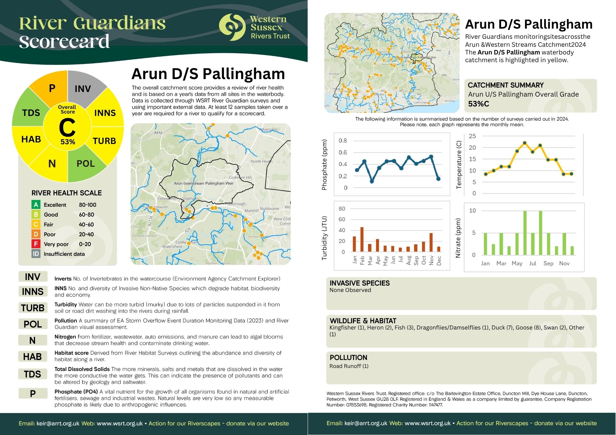
We are starting to create a store of examples such as those below. More resources and templates for data visualisation are under development.